
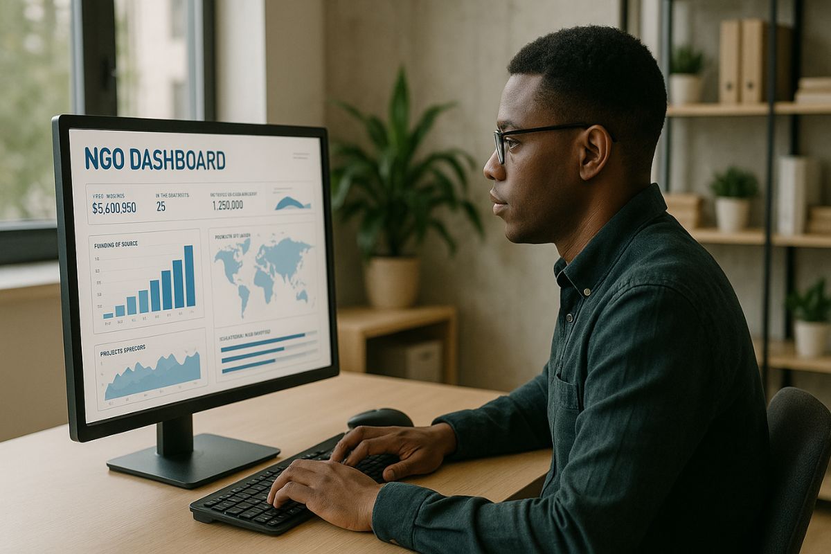
Build Data Dashboards for NGO Insights
Non-governmental organizations generate data every day—from field reports to fundraising outcomes, service reach, and policy advocacy impacts. But turning those figures into meaningful, real-time insights often gets pushed aside due to limited capacity or unfamiliar tools. Data dashboards offer a clear, accessible way for NGOs to make smarter decisions, improve transparency, and communicate their progress more effectively.
The ability to translate raw data into actionable views is not just a tech upgrade. For mission-driven teams, it’s a shift toward responsiveness, accountability, and collaboration.
Why Data Dashboards Make a Difference
This post highlights how NGOs can use data dashboards to manage their work better, demonstrate outcomes to donors, and stay aligned with their mission. It also offers practical guidance on choosing tools, designing meaningful metrics, and rolling out a dashboard with team buy-in.
From Spreadsheets to Storytelling
Many NGOs collect data through spreadsheets or written reports, often filed away for quarterly reviews or donor summaries. While this is valuable, it usually misses the opportunity for real-time learning. Dashboards step in as a visual storytelling tool. They turn rows of numbers into patterns and alerts.
Instead of scanning columns of statistics to find trends, staff and partners can glance at a dashboard and understand what’s working, what’s falling behind, and where to dig deeper.
Well-built dashboards serve internal and external needs. Staff use them to monitor program reach or grant timelines. Funders check them for impact. Boards reference them to make informed decisions. Most importantly, dashboards bring clarity to complexity.
Focus on What Matters
Not all data deserves equal attention. NGOs need to start by asking what they want to learn. The most helpful dashboards begin with a question: Are we reaching the communities we aim to serve? Are response times improving? Is funding allocated as planned?
This helps avoid dashboard overload—too many widgets, too little meaning. Focusing on a few key indicators ensures that the data drives insight, not confusion. Ideally, each view should answer a specific need.
For example, a legal aid organization might track:
- number of active cases per region
- time from intake to resolution
- demographics of clients served
- budget spent by service category
Each metric should be grounded in what success looks like for the team. If no one on the ground finds a metric useful, it’s probably not essential.
Choosing the Right Tool
From free tools like Google Data Studio to open-source software such as Metabase, NGOs have more options than ever to build dashboards without massive budgets. The right tool depends on the organization’s comfort level, available data sources, and technical support.
Some dashboards connect to Excel sheets; others pull from cloud databases. Some offer drag-and-drop design; others require SQL queries. Simplicity often wins out, especially for teams with limited tech support. The goal is clarity, not complexity.
More important than the platform is ownership. Who will update the dashboard? Who ensures that data is accurate and timely? Success depends on having someone responsible for maintaining the tool, even if it’s just once a week.
Building Buy-In Across the Team
No dashboard can succeed in isolation. If staff view it as a management surveillance tool or a burden, it won’t last. But when teams see how it can save them time, highlight their wins, or make their case to donors, enthusiasm follows.
Involve users early. Ask them what information they wish they had on hand. Share mockups. Iterate based on real feedback. When the tool aligns with real needs, it becomes part of the workflow instead of just another thing to check.
Leadership also plays a role. If board members ask about dashboard trends during meetings, it signals that data matters. If program managers use it to adjust tactics, staff will follow suit.
Keep It Accessible
A dashboard that only one person understands is not a solution—it’s a bottleneck. Keep the language plain. Use simple visualizations. Include definitions or hover-over tips where needed. And make sure it works on mobile devices or shared drives.
Some organizations print and post monthly dashboard snapshots on office walls. Others send regular updates via email. The key is consistency. If people know they can rely on the dashboard for updates, they’ll use it more often.
Accessibility also means keeping visuals inclusive. Use color schemes that work for color-blind users. Avoid overly small fonts. Always make sure charts have labels.
Align With Values
NGOs committed to transparency, equity, or community inclusion should let those values shape their dashboards. For example, a human rights organization might choose to display data on service gaps or community participation rates.
Data shouldn’t be a tool of control—it should be a source of learning. Make space for qualitative feedback or community voice. Use dashboards not only to show achievements but to highlight areas for growth.
When to Revisit and Refresh
Dashboards are not static. As programs evolve, metrics must shift too. A review every six months or after major strategy updates keeps the dashboard relevant. If staff stop looking at it, ask why. Are the indicators outdated? Is the tool hard to use?
Sometimes, less is more. Removing unused charts can make the rest more meaningful. Other times, adding new data points helps reflect a broader range of activity. Keep checking in with users to see what they need.
A Shared Window Into Progress
At their best, dashboards become shared spaces for learning. They invite teams to celebrate success, adapt to setbacks, and work with clarity. They remind everyone what the mission looks like in numbers, not just words.
And for NGOs working under pressure—limited staff, complex needs, shifting donor expectations—clarity is power. A good dashboard doesn’t just show what happened. It helps shape what happens next.
With the right tools, clear goals, and team support, data dashboards can make NGO work more informed, transparent, and focused on real impact.